BLOG
KO
Using Modals Declaratively (feat. useOverlay)
- 1. Defining Modal Structure
- 2. Implementing Modal Components
- 3. Refactoring with useOverlay
- Conclusion
- References
When developing web services, you end up using 'modals' more often than you'd think.
At ABJET where I currently work, we actively utilize various modals including service announcements and more.
As our service gradually became more sophisticated and we needed to develop various modals within short timeframes, I felt the necessity for componentization for reusability and writing intuitive code that anyone could understand.
In this post, I want to summarize how we previously implemented modal components and how we improved them.
Through this post, you can learn about:
- The implementation method and problems of existing Modal components
- How to improve modal components through declarative code writing
1. Defining Modal Structure
Rather than writing code first when implementing modals, I wanted to break down modals into different sections and clarify the role of each section.
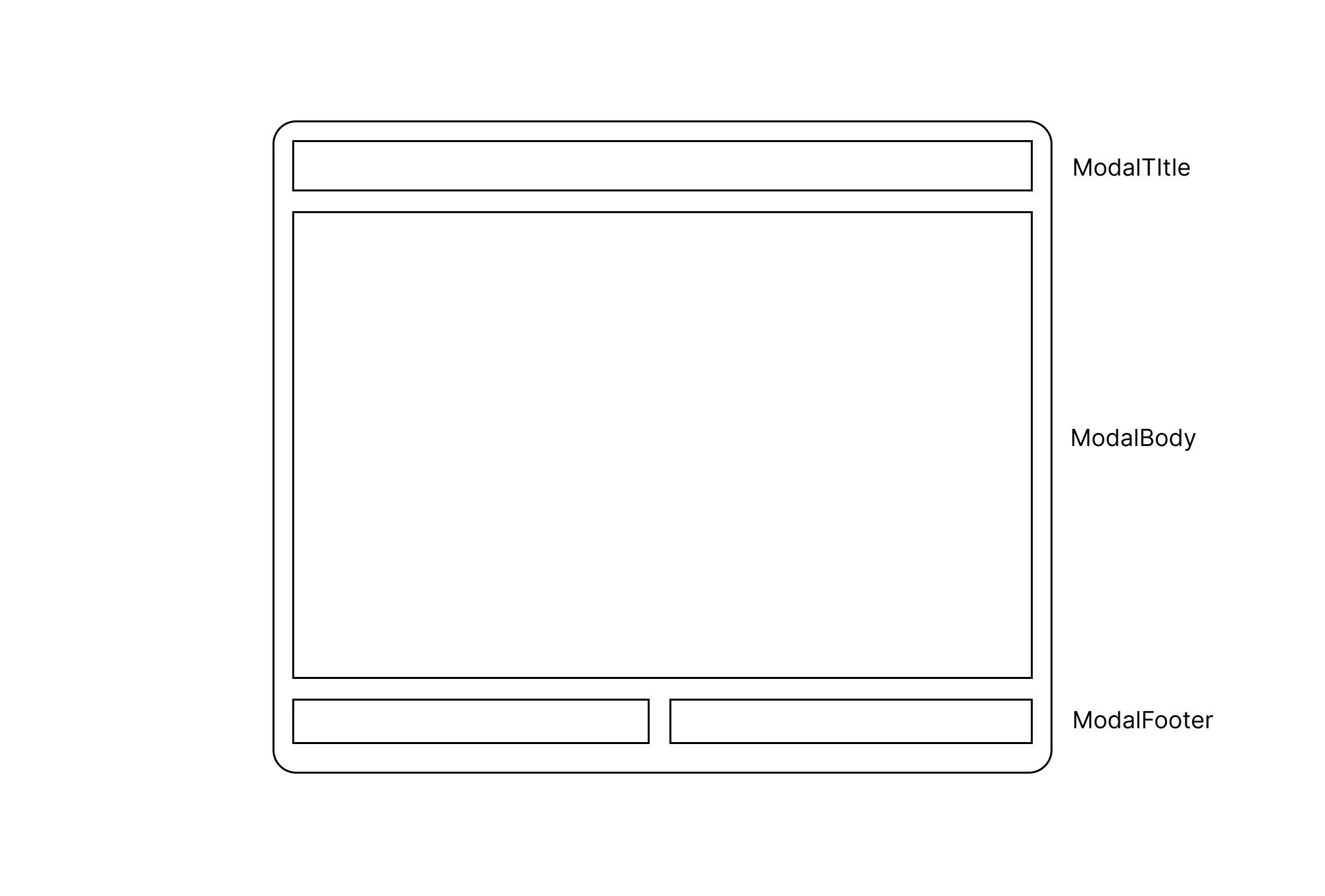
The above diagram is a rough illustration defining the common UI of modal components - UI that's commonly used in any modal.
Let's take a simple look:
- When a modal appears, a backdrop covers the existing screen and the modal is positioned at the center of the screen
- The modal is largely divided into 3 sections
- The
ModalTitlearea specifies the modal's title and role - The
ModalBodyarea contains the actual modal content - The
ModalFooterarea is for action buttons
2. Implementing Modal Components
For implementing modal components, I referenced Channel Talk's open-source design system bezier-react.
Before diving into detailed explanations, here's a simple Anatomy of bezier-react's Modal component:
// Component structure
<Modal>
  <ModalTrigger />
  <ModalContent>
    <ModalHeader />
    <ModalBody />
    <ModalFooter />
  </ModalContent>
</Modal>
I judged it similar to the modal we wanted to implement - the way modals are opened and closed through trigger, and how three areas Header, Body, and Footer come together to form one modal.
Based on this, the final implemented modal code is as follows:
// Modal.tsx
// Handles the actual UI of the modal. ModalTitle, ModalBody, ModalFooter are included here.
function ModalContent() {
  const { style, onCloseModal, disableOutsideClick, footer } =
    useContext(ModalContext);
  const modalContentRef = useRef<HTMLDivElement>(null);

  useOutsideClick(modalContentRef, () => {
    if (!disableOutsideClick && onCloseModal) onCloseModal();
  });

  return (
    <S.ModalWrapper ref={modalContentRef} style={style}>
      <ModalTitle />
      <ModalBody />
      {footer && <ModalFooter />}
    </S.ModalWrapper>
  );
}

/**
 * Modal component for covering the page and receiving user input or simple confirmation.
 * When children are passed as props, they are delivered to the ModalTrigger component.
 * When ModalTrigger is clicked, the modal is displayed and the modal content itself is rendered to the backdrop through a portal.
 *
 * Instead of using children, when using the Modal component externally, you can control the modal using `externalShow` and `onCloseModal`.
 *
 * When `type` is confirm, `title` is string. When `type` is close, title is string | React.ReactNode.
 *
 * @example
 * ```tsx
 * // Modal structure
 * <Modal>
 *  <ModalTrigger />
 *  <ModalContent>
 *    <ModalTitle />
 *    <ModalBody />
 *    <ModalFooter />
 *  </ModalContent>
 * </Modal>
 * ```
 */
export function Modal(props: ModalProps) {
  const { children, onShow, onCloseModal, externalShow } = props;
  const [backdrop, setBackdrop] = useState<HTMLDivElement | null>(null);
  // state managing the modal's visibility
  const [show, setShow] = useState(externalShow || false);

  const onClickShowModal = () => {
    setShow(true);
  };

  const onClickCloseModal = () => {
    if (onCloseModal) onCloseModal();
    setShow(false);
  };

  // An element with backdrop id exists in _app.tsx
  useEffect(() => {
    setBackdrop(document.getElementById('backdrop') as HTMLDivElement);
  }, []);

  useEffect(() => {
    if (show && onShow) onShow();
  }, [show, onShow]);

  useEffect(() => {
    if (externalShow !== undefined) {
      setShow(externalShow);
    }
  }, [externalShow]);

  return (
    <>
      {children && (
        <ModalTrigger onClickShowModal={onClickShowModal}>
          {children}
        </ModalTrigger>
      )}
      {show && (
        <ModalContext.Provider
          value={{ ...props, onCloseModal: onClickCloseModal }}
        >
          {backdrop &&
            (createPortal(
              <Backdrop deep>
                <ModalContent />
              </Backdrop>,
              backdrop as HTMLDivElement
            ) as ReactNode)}
        </ModalContext.Provider>
      )}
    </>
  );
}
The component's anatomy and usage are not much different from the referenced bezier-react, but the code looks longer and more complex. This is because the modal functionality required by our service became more complex compared to when it was first implemented.
- Deciding whether to close the modal when clicking outside (
disableOutsideClick) - Controlling modal opening/closing without using a separate component (ModalTrigger) (
externalShow: meaning to show the modal from outside the modal)
The actual modal component written based on the above code was as follows:
<Modal
  type={MODAL_TYPES.CONFIRM} // UI of ModalTitle area changes based on type
  title={isEdit ? 'Edit Group' : 'Add Group'}
  titleAlign="left" // text-align direction of title
  externalShow={externalShow}
  onCloseModal={onCloseModal}
  content={ // actual modal content
    <StyledInput
      guide="Group Name"
      required
      clearable
      width={'100%'}
      value={productName}
      maxLength={20}
      onInput={handleOnInput}
      placeholder="Enter group name (max 20 characters)"
    />
  }
  footer={{ // modal footer area
    left: (
      <Button size="medium" fullWidth>
        Go Back
      </Button>
    ),
    right: (
      <Button
        size="medium"
        type="primary"
        onClick={onClickSave}
        fullWidth
        disabled={!productName}
      >
        Save
      </Button>
    ),
  }}
/>
Now it gradually became something that's hard to call a component - a modal component that would be difficult to understand without explanation from the creator... 😥

3. Refactoring with useOverlay
One day, while struggling with the modal component that had become a burden, a period came when feature sprints were somewhat completed and I could refactor the code.
There were many tasks that could be solved including infrastructure improvements and considerations for new projects, but I prioritized modal component refactoring first for the following reasons:
- Increased necessity for unified modal logic in gradual monorepo adoption
- Efficient code became essential for feature deployment in short periods
While thinking about how to solve the critical shortcomings of managing with state and props, I encountered toss-slash's useOverlay.
useOverlay is a utility for handling Overlay declaratively.
I focused on the word "declarative" here. In programming, "declarative" is a concept that contrasts with "imperative". According to React's official documentation, declarative programming means describing UI with each visual state rather than directly manipulating the UI. Going a step further, Toss FE Chapter considers declarative code as "code with a higher level of abstraction".
In other words, the modal component code I had written was code that was difficult to respond to diversification (code with a low level of abstraction) and was gradually becoming bad code.
Reminding myself of the mindset of "being uncomfortable with discomfort", I proceeded with refactoring all existing modal components using the useOverlay hook, and the key points to consider during this process were:
- Not trying to handle various modal UIs with one component (= raising the abstraction level)
- Creating a structure that allows quick development even when new modal UI development is needed
The modal code I implemented after thinking based on the above content is as follows:
// components/common/Modal/Modal.tsx
import { forwardRef, useEffect, useState } from 'react';
import { createPortal } from 'react-dom';
import { Backdrop } from '../Backdrop';

import * as S from './styled';

export const Modal = forwardRef(function Modal<T>({
  open,
  children,
  width = 375,
}: {
  open: boolean;
  children: React.ReactElement<T>;
  width?: number;
}) {
  const [backdrop, setBackdrop] = useState<HTMLDivElement | null>(null);

  useEffect(() => {
    setBackdrop(document.getElementById('backdrop') as HTMLDivElement);
  }, []);

  return (
    <>
      {open &&
        backdrop &&
        createPortal(
          <Backdrop deep>
            <S.ModalWrapper style={{ width: width }}>{children}</S.ModalWrapper>
          </Backdrop>,
          backdrop as HTMLDivElement
        )}
    </>
  );
});
// ex) Modal usage example - useSpecificModal
import { Modal } from '@/components/common';
export function useSpecificModal() {
const overlay = useOverlay(); // Using Toss's useOverlay hook
return useMemo(
() => ({
open: (id: number) =>
overlay.open(({ isOpen, close }) => (
<Modal open={isOpen} width={610}>
{/* Component that will be Modal's contents goes in as children */}
</Modal>
)),
close: overlay.close,
}),
[overlay]
);
}First, I raised the abstraction level of the common UI for all modal components and defined it.
In other words, I defined a common Modal component that implements only backdrop and center alignment, not including division into three areas.
Next, I defined custom hooks with the useOverlay hook according to each modal's required situation to use each modal declaratively. When additional props need to be passed, I implemented it by passing the necessary props to the open method and receiving them in the Modal component.
So how did the code change compared to before refactoring?
// AS_IS: Before refactoring, need to define show state for each modal, handle numerous props = verbose code 😥
const [showSpecificModal, setShowSpecificModal] = useState(false)
...
<SpecificModal
  show={showSpecificModal}
  // numerous other necessary props
/>

// TO_BE: After refactoring, code became much more concise and clear. Higher abstraction level = more React-like! 😊
const { open } = useSpecificModal()
Even though I didn't perform any technically tremendous work, I could confirm that the code's readability improved significantly and became code that anyone could understand. For writing new modals afterward, I was able to develop much faster than before using the Modal component and useOverlay hook.
Conclusion
The currently refactored modal code is only being used in one repository, but going further, I'm at the stage of reviewing the inclusion of modals and hooks in the design system through close communication with designers and fellow FE developers.
Also, rather than stopping refactoring here, I plan to continue thinking about ways to write more concise code and separate common logic.
Through this refactoring, I was able to learn how to write more React-like code and how to write better code that goes beyond my existing code. Going forward, I want to continue solving various "discomforts" through consistent thinking.